[math_line_graph_game]
Dive into the world of coordinate geometry with the Math Line Graph Game, a fun and educational tool designed to enhance your understanding of plotting points and drawing lines on a Cartesian plane. This interactive game is perfect for students, educators, and anyone looking to sharpen their math skills in a visual and engaging way.
Features:
- Interactive Grid: The game features a 10×10 grid where users can easily plot points by entering their x and y coordinates.
- Point Plotting: Simply input the coordinates and click “Plot Point” to see your point appear on the grid. Each point is marked in red for clear visibility.
- Line Drawing: Once two or more points are plotted, the game automatically connects them with a blue line, helping users visualize the linear relationship.
- Validation Tool: Use the “Check Line” feature to verify if all plotted points lie on the same straight line. This function calculates the slope and intercept, ensuring the accuracy of your plotted line.
- Educational: Perfect for learning and teaching the basics of coordinate geometry, including plotting points, understanding slopes, and linear equations.
- User-Friendly: The game is designed with simplicity in mind, making it accessible for all ages. The intuitive controls and clear instructions make it easy to get started and enjoy the learning process.
How to Play:
- Input Coordinates: Enter the x and y coordinates in the provided input fields.
- Plot Points: Click the “Plot Point” button to add the point to the grid.
- Draw Lines: After plotting at least two points, observe the blue line that connects them.
- Check Line: Click the “Check Line” button to verify if the plotted points form a straight line.
- Adjust and Learn: Modify your points and continue experimenting to better understand the principles of coordinate geometry.
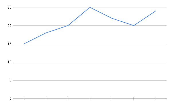
Worksheet 1: Reading Line Graphs
Graph Description: A line graph showing the temperature over a week. The x-axis represents the days of the week (Monday to Sunday), and the y-axis represents the temperature in degrees Celsius

Instructions: Study the line graph and answer the questions below.
- What was the temperature on Monday?
- Which day had the highest temperature?
- How much did the temperature increase from Wednesday to Thursday?
- On which day was the temperature 20°C?
- What was the average temperature for the week?
Challenge Problems:
- Between which two days was the biggest temperature change?
- How much did the temperature decrease from Friday to Saturday?
- If the temperature on Sunday was 25°C, what was the temperature on Friday?
Worksheet 2: Creating Line Graphs
Data:
| Day | Sales (in dollars) |
|---|---|
| Monday | 200 |
| Tuesday | 250 |
| Wednesday | 300 |
| Thursday | 400 |
| Friday | 350 |
| Saturday | 450 |
| Sunday | 500 |
Instructions: Use the data above to create a line graph. The x-axis should represent the days of the week (Monday to Sunday), and the y-axis should represent the sales in dollars (ranging from 0 to 600 dollars).
Questions:
- Plot the data on a line graph.
- Which day had the highest sales?
- How much did the sales increase from Tuesday to Wednesday?
- On which day did the sales reach 400 dollars?
- What was the average sales amount for the week?
Challenge Problems:
- Between which two days was the biggest increase in sales?
- How much did the sales decrease from Saturday to Friday?
- If the sales on Monday were 250 dollars, what were the sales on Tuesday?
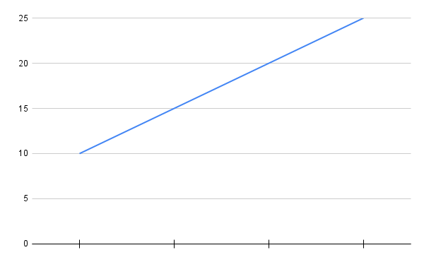
Worksheet 3: Interpreting Line Graphs
Graph Description: A line graph showing the number of books read by students over a month. The x-axis represents the weeks (Week 1 to Week 4), and the y-axis represents the number of books read

Instructions: Study the line graph and answer the questions below.
- How many books were read in the first week?
- Which week had the highest number of books read?
- How many more books were read in the fourth week compared to the second week?
- In which week were 15 books read?
- What was the total number of books read over the month?
Challenge Problems:
- Between which two weeks was the biggest increase in the number of books read?
- How many books were read in the third week?
- If the number of books read in the fifth week was 20, what was the number of books read in the second week?
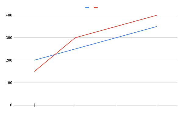
Worksheet 4: Comparing Line Graphs
Graph Description: Two line graphs showing the weekly sales of two stores over a month. The x-axis represents the weeks (Week 1 to Week 4), and the y-axis represents the sales in dollars

Instructions: Study the two line graphs and answer the questions below.
- Which store had higher sales in the first week?
- How much did the sales increase for Store A from the second week to the third week?
- In which week did Store B have the highest sales?
- Which store had the lowest sales in the fourth week?
- What was the total sales for Store A over the month?
Challenge Problems:
- Between which two weeks did Store B have the biggest increase in sales?
- How much did the sales decrease for Store A from the third week to the fourth week?
- If the sales for Store A in the fifth week were 100 dollars, what were the sales for Store B in the fourth week?
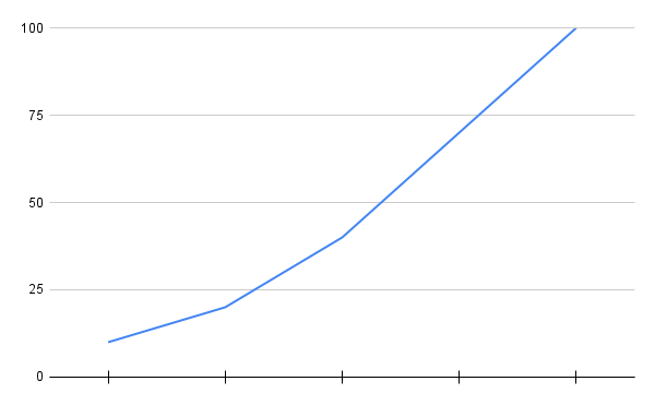
Worksheet 5: Analyzing Line Graphs
Graph Description: A line graph showing the distance traveled by a car over a period of 5 hours. The x-axis represents the hours (Hour 1 to Hour 5), and the y-axis represents the distance in kilometers

Instructions: Study the line graph and answer the questions below.
- How far did the car travel in the first hour?
- In which hour did the car travel the furthest distance?
- How much distance was traveled in the third hour?
- At what hour was the distance 60 km?
- What was the total distance traveled in 5 hours?
Challenge Problems:
- Between which two hours was the biggest increase in distance traveled?
- How much did the distance decrease from the fourth hour to the fifth hour?
- If the car traveled 70 km in the sixth hour, what was the distance traveled in the second hour?
Leave a Reply